Affinity
Affinity
Brand Strategy & Identity Design
Affinity was in need of a foundational brand strategy and new visual identity. They were growing fast, and expanding outside of their core audience.
The rebrand features a quality of humanity, warmth, and optimism for this B2B SaaS company.
Affinity was in need of a foundational brand strategy and new visual identity. They were growing fast, and expanding outside of their core audience.
The rebrand features a quality of humanity, warmth, and optimism for this B2B SaaS company.
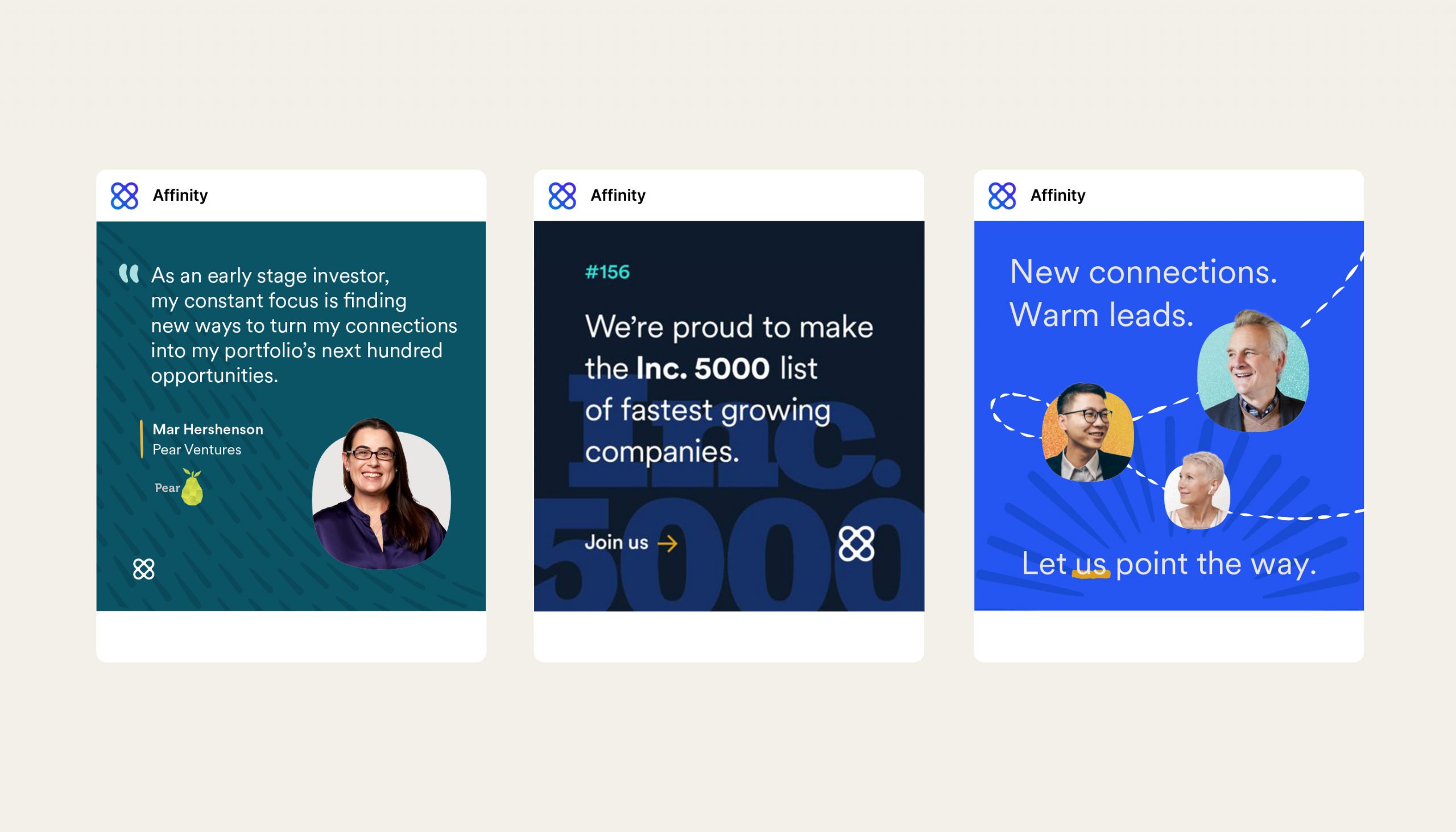
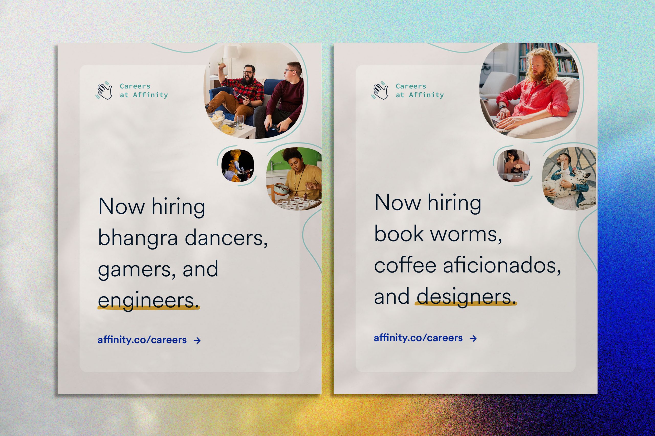
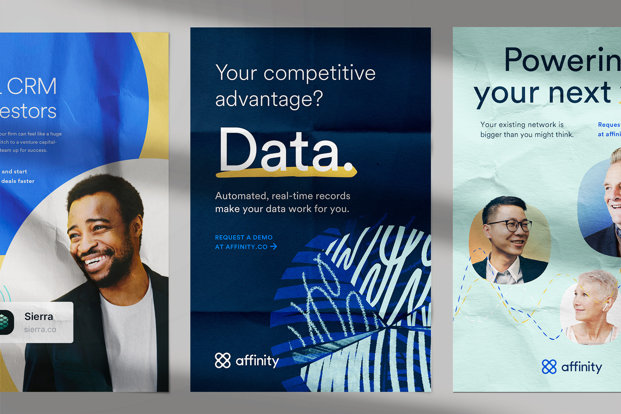
Photography drives the core values of Human and Trustworthy, in which the style is grounded in reality, and captures candid moments.
Photography drives the core values of Human and Trustworthy, in which the style is grounded in reality, and captures candid moments.

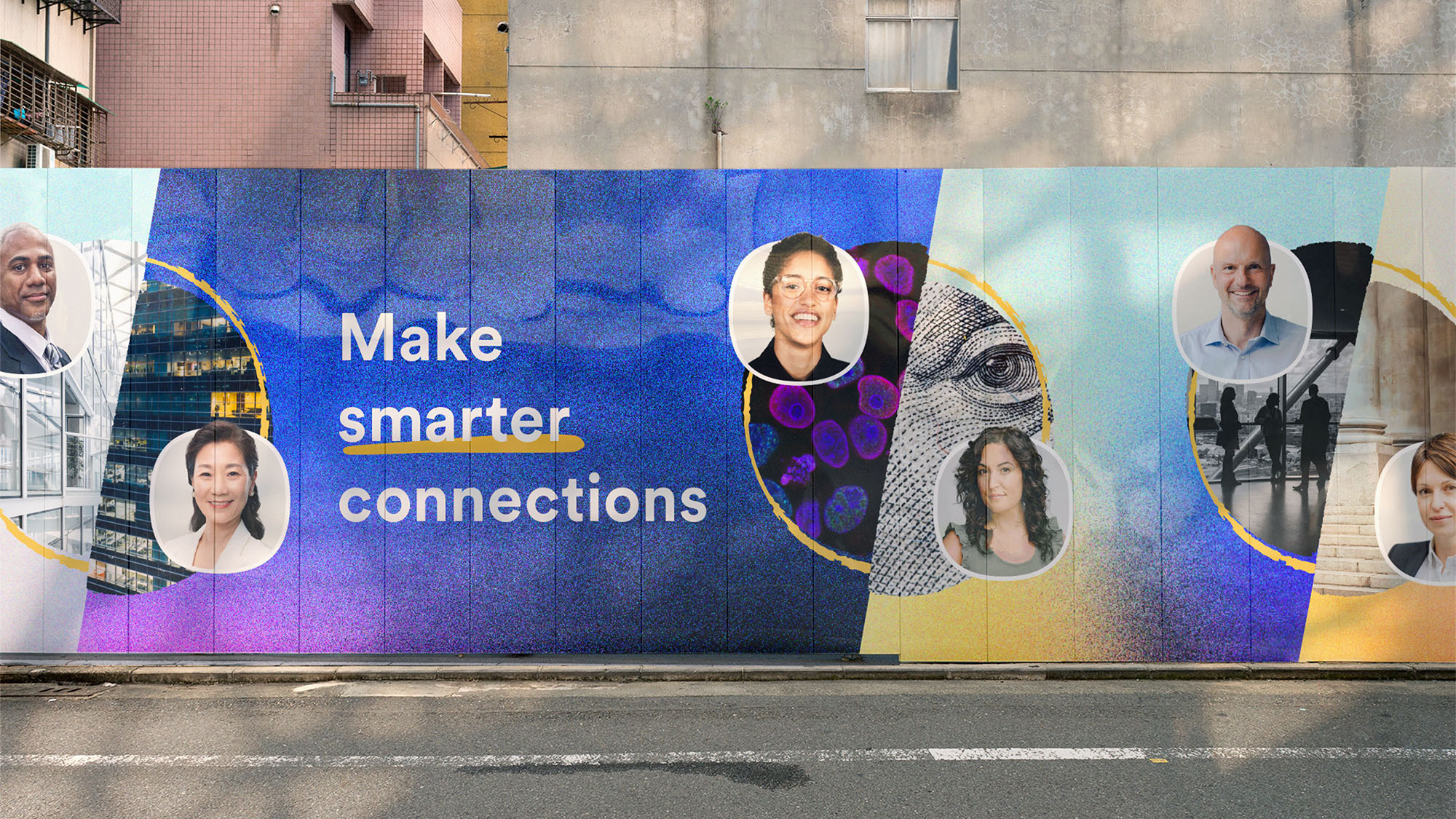
In reference to the Design Principle of Alive, and our core value of Human, the people we feature are bursting out of their avatar in a way that brings them to life.
In reference to the Design Principle of Alive, and our core value of Human, the people we feature are bursting out of their avatar in a way that brings them to life.
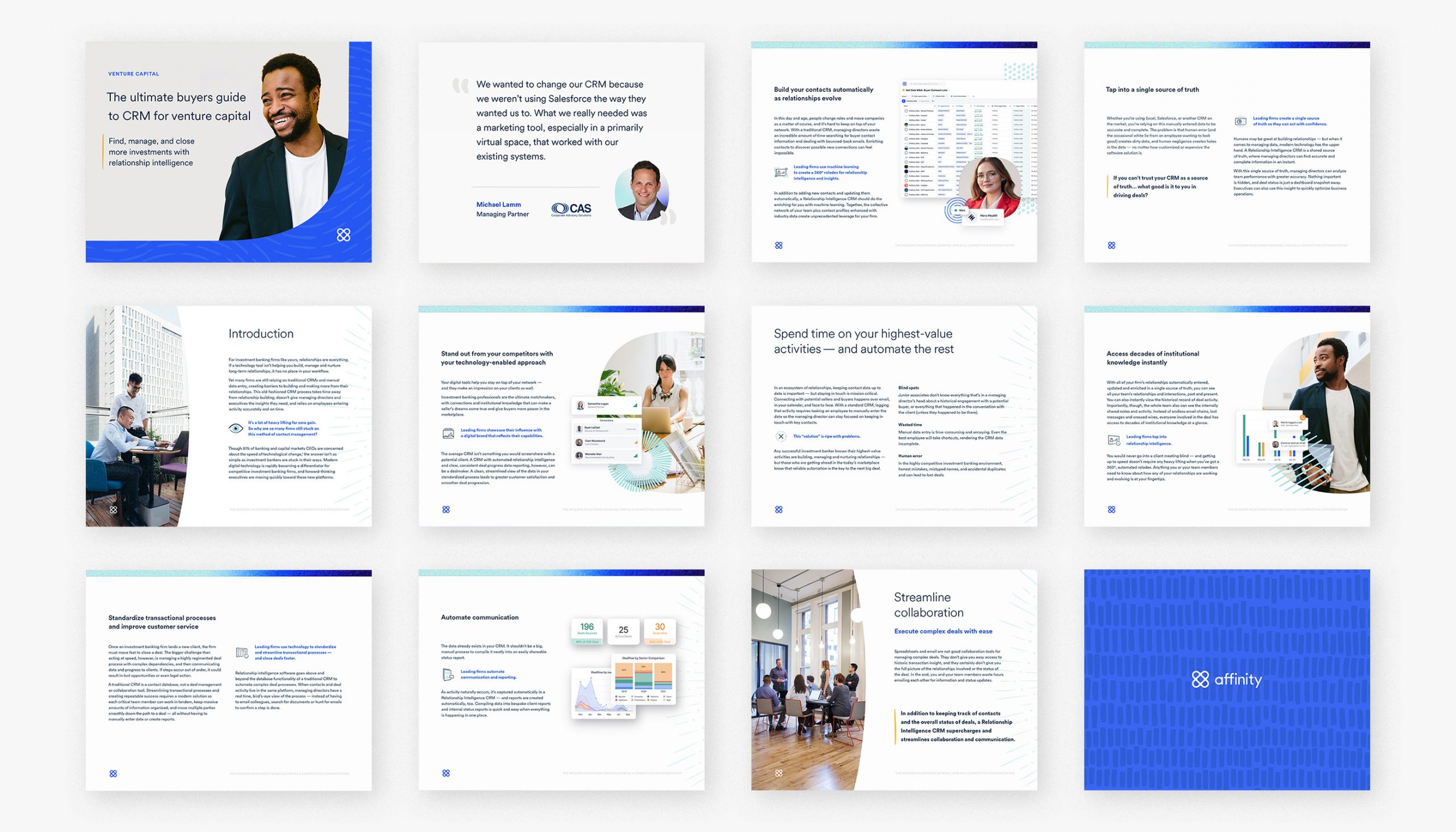
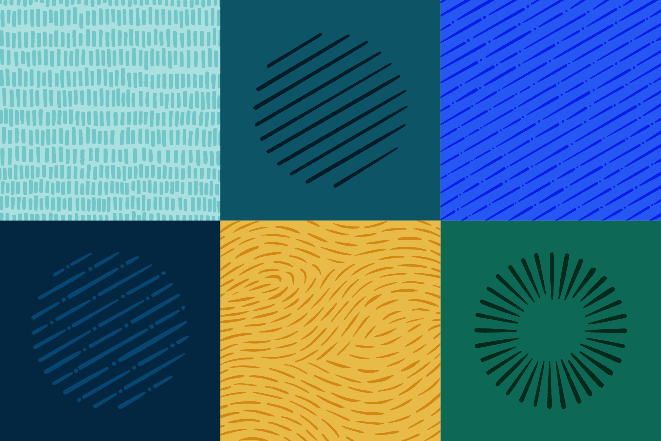
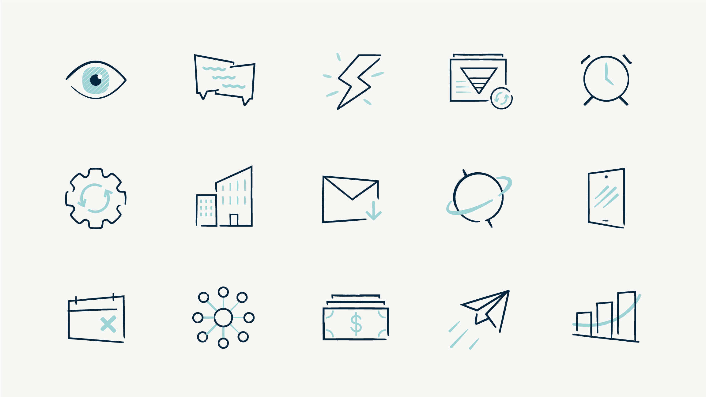
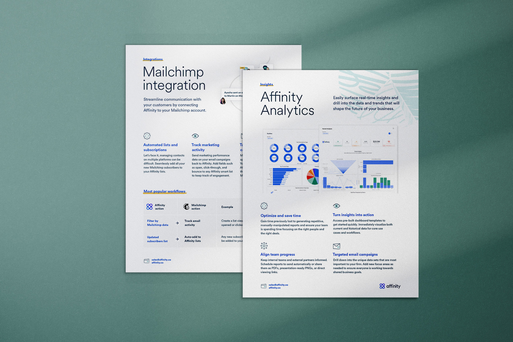
The robust data offering served as inspiration for the bold patterns. The rigidity of the data visualizations is balanced with the warm, hand-drawn lines.
The robust data offering served as inspiration for the bold patterns. The rigidity of the data visualizations is balanced with the warm, hand-drawn lines.
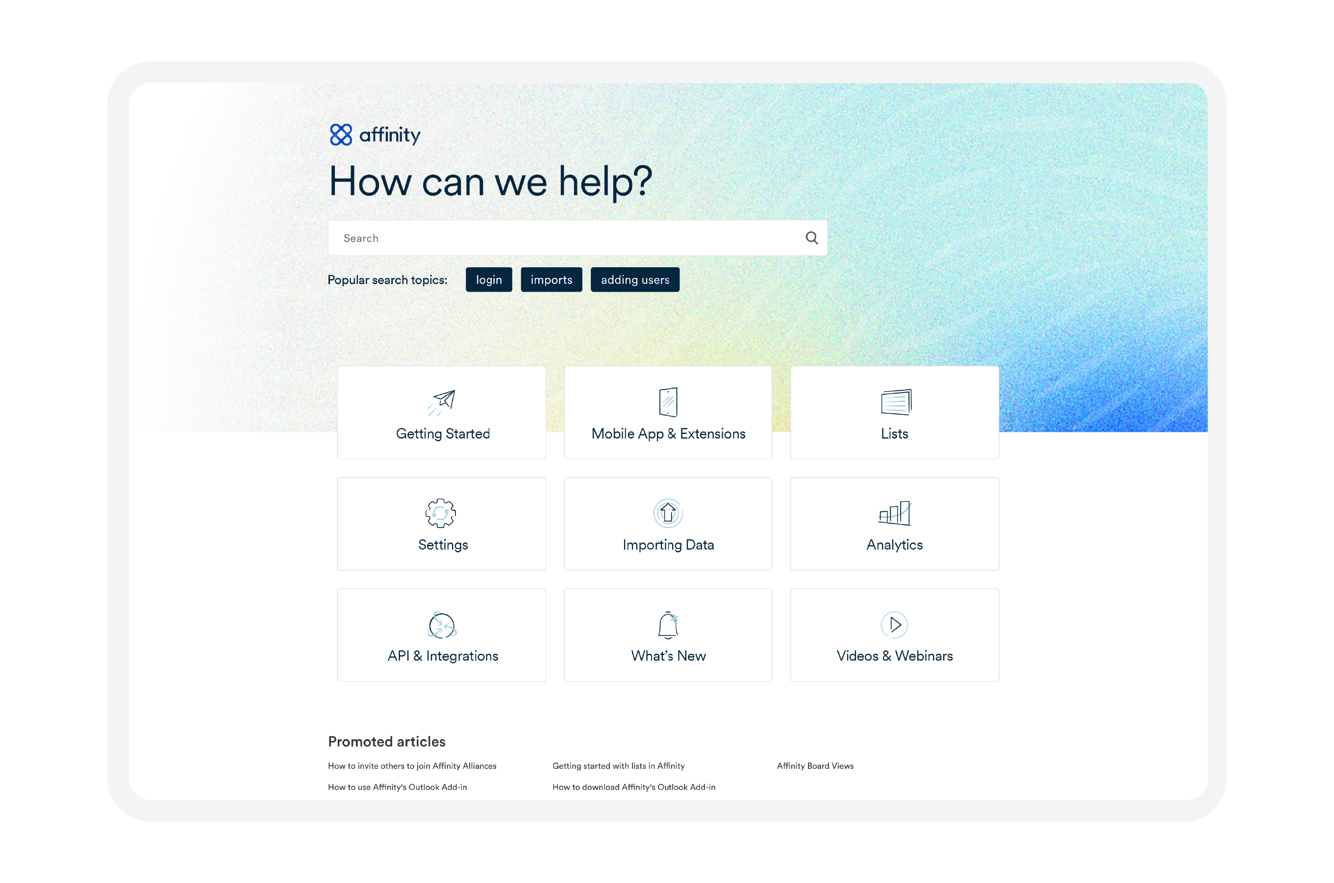
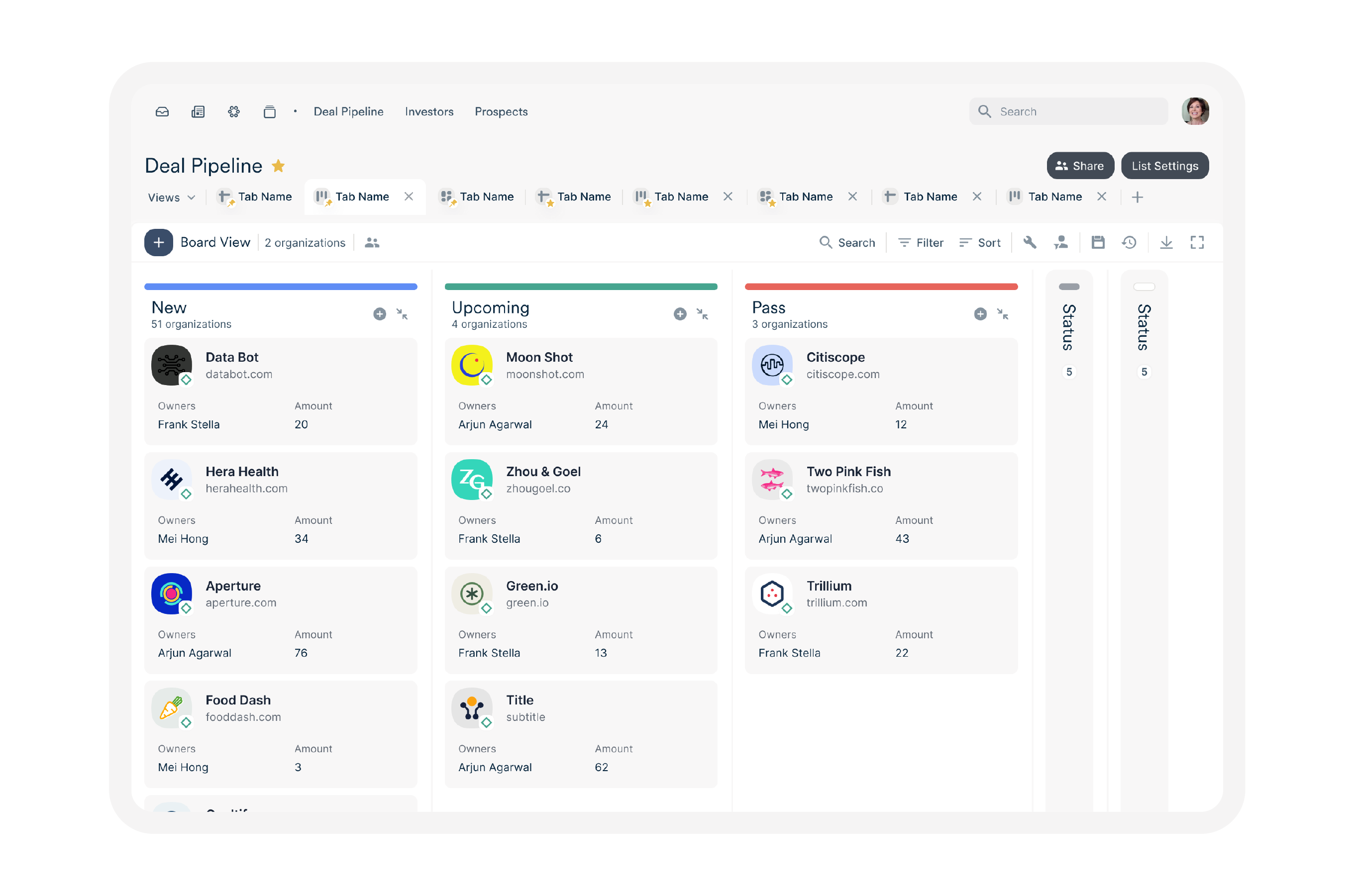
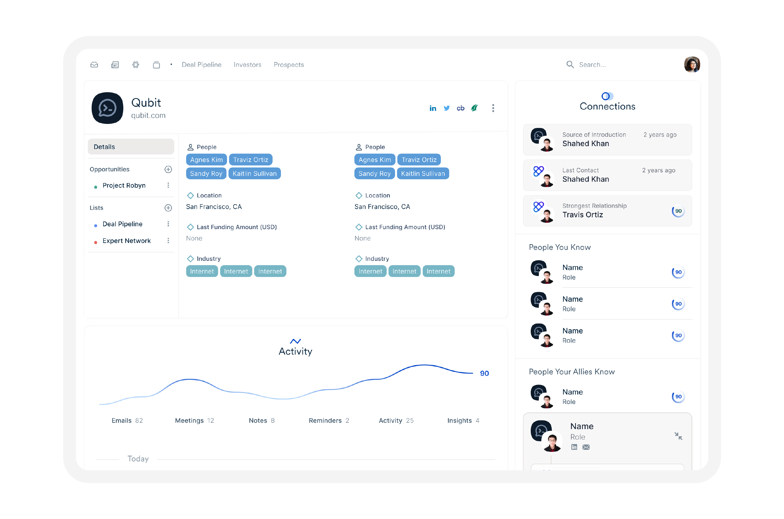
Aligning the marketing experience with the product experience was vital. Typography, spot illustrations, and color were identified as quick wins to tackle first.
Aligning the marketing experience with the product experience was vital. Typography, spot illustrations, and color were identified as quick wins to tackle first.
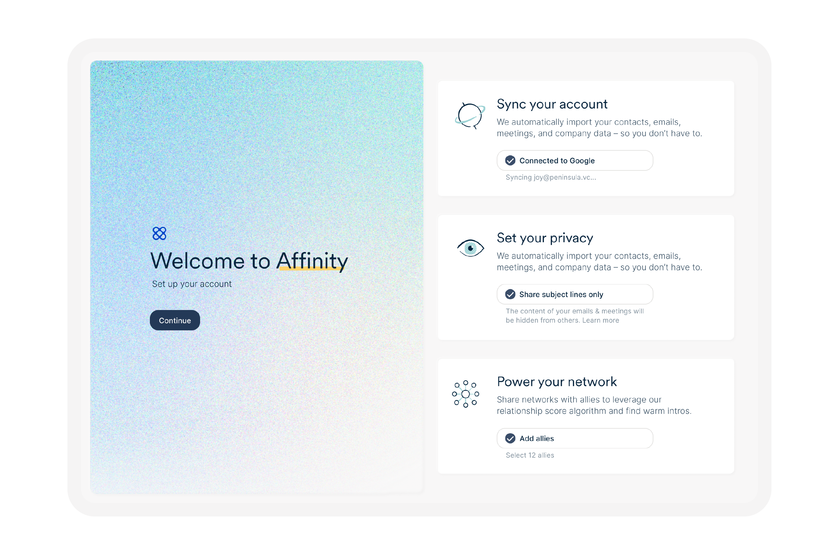

The color palette largely features bold colors, and a grainy gradient in multiple variations. With the addition of motion, the gradient is a nod to the ever-changing network.
The color palette largely features bold colors, and a grainy gradient in multiple variations. With the addition of motion, the gradient is a nod to the ever-changing network.
Team
Kaitlin Sullivan
Travis Ortiz
Filip Skrzesinski
Team
Kaitlin Sullivan
Travis Ortiz
Filip Skrzesinski
More this way
More this way
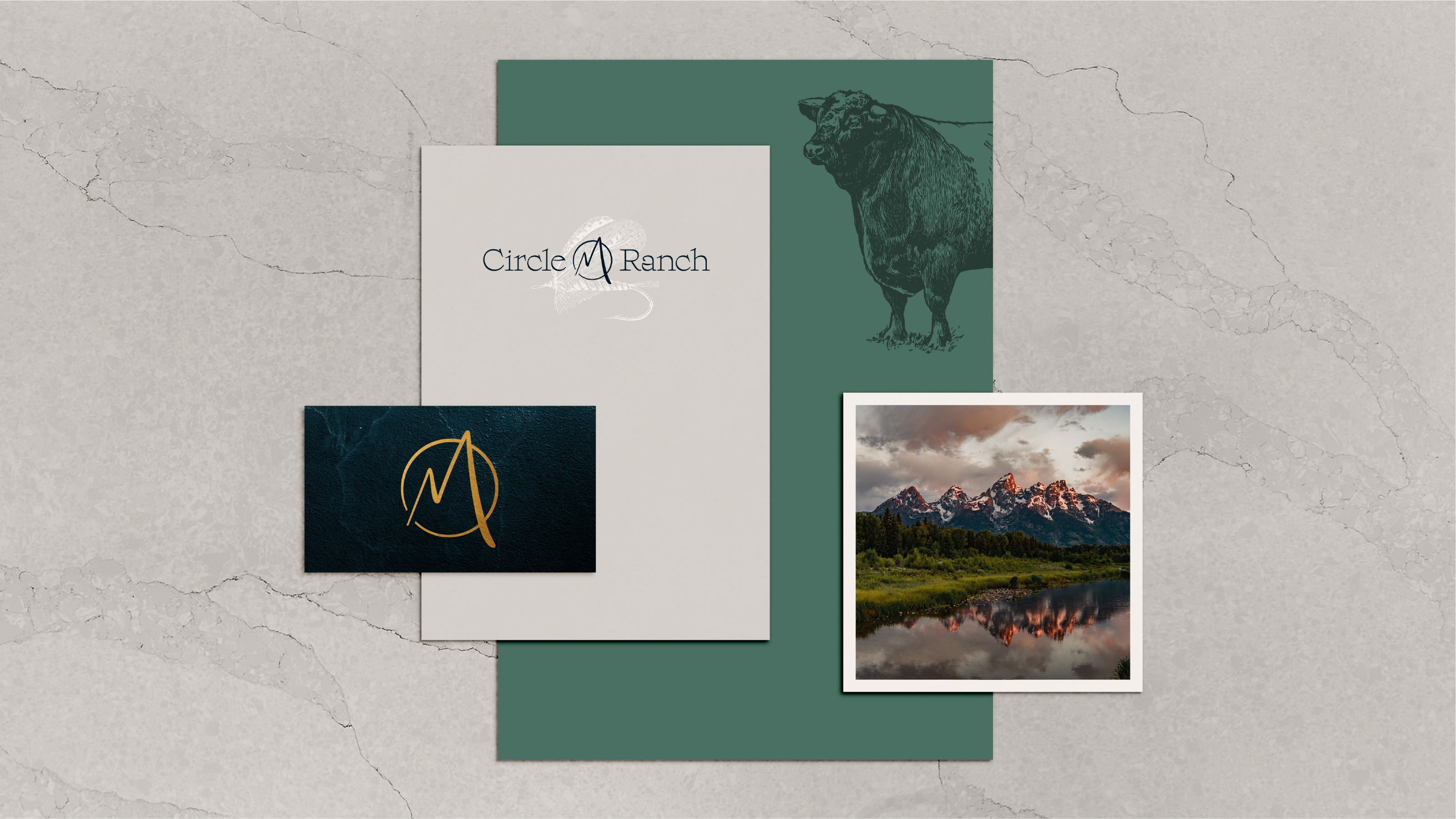
Circle M Ranch
Brand Identity